Startups
Partner.io Interface Redesign for Clearer Navigation and Higher Productivity

Introducing the New Partner.io Interface: Clarity, Control, and Conversion in Every Click
The new Partner.io sidebar is more than a visual refresh; it’s a full-scale redesign of how partner management should feel. Every element has been rethought, restructured, and realigned to match the way users actually work.
The previous interface gave equal weight to every feature. That approach created noise: too many top-level items, a lack of visual rhythm, and excessive cognitive load. The new sidebar eliminates that friction. Through precise hierarchy and logical grouping, Partner.io now delivers a cleaner, faster, more focused navigation experience.

Key structural improvements:
Consolidated architecture: Related features- Badges, Rewards, Tiers, and Courses are unified within a single Engagement Hub, making partner enablement intuitive and cohesive.
Action-first organization: Core, high-frequency tools like Dashboard, Notifications, Tasks, Leads, and Payments sit prominently at the top, reducing click distance and cognitive delay.
Administrative clarity: Configurations and backend management tools are grouped below under Portal Admin, Integrations, and Settings, decluttering the main experience.
Visual discipline: Uniform icon weight, spacing, and indentation establish a visual rhythm that improves scan speed and spatial memory.
Modern UX principles: Enhanced whitespace, concise labels, and consistent section spacing create a calm, balanced interface optimized for focus.
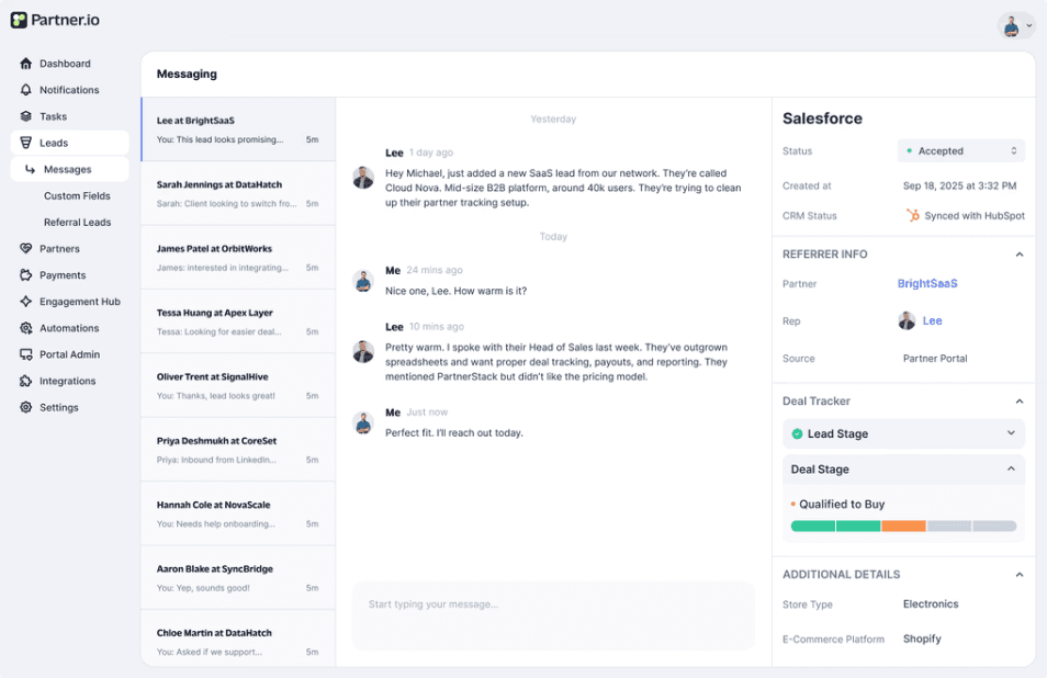
This redesign goes beyond aesthetics. It represents a cognitive shift toward intent-driven navigation where every interaction moves users closer to outcomes, not options. The single notification badge streamlines alerts, while the active-state highlighting anchors orientation.
The result is a sidebar that thinks like its users are structured, purposeful, and adaptive to real workflows. Partner.io’s updated design increases discoverability, reduces onboarding time, and accelerates engagement across partner programs.
Why it matters:
In a digital ecosystem where speed and clarity define productivity, Partner.io’s refined information architecture ensures every click translates into progress. Fewer distractions mean faster execution and better results. This isn’t just a redesign, it’s a redefinition of partner enablement UX.

Recommended Reading

